How to Increase Your Website’s Conversion Rate: A Comprehensive Guide to Website Conversion
Are you looking to increase the conversion rate on your website? Look no further! Below, you’ll find the ultimate guide to improving your conversion rates. We’ve compiled the top tactics and tips for optimizing every aspect of your website. With this guide in hand, you’ll be well on your way to boosting your ROI and growing your business.
Introduction to Conversion Rate Optimization (CRO)
What is conversion rate optimization?
Conversion rate optimization (CRO) is the process of increasing the number of website visitors who take a desired action, such as making a purchase or filling out a form.
Why is the conversion rate important?
CRO involves analyzing and testing various elements of your website, such as the design, layout, and texts, to determine what works best in persuading visitors to take action. CRO measures the effectiveness of different strategies and recommends what to keep and what to change.
Check out our free eBook also: Optimizing the conversion factor from the basis
How is the conversion rate calculated?
The conversion rate is calculated by dividing the number of conversions by the number of website visitors. The result is expressed as a percentage.
Conversion rate = (number of conversions / number of visitors) × 100
For example, if your website had 100 visitors and 10 of them made a purchase, the conversion rate was 10%. The average conversion rate depends on the industry.
Read also: How to Calculate Cost Per Lead (& Why It's Important)
What is the conversion funnel?
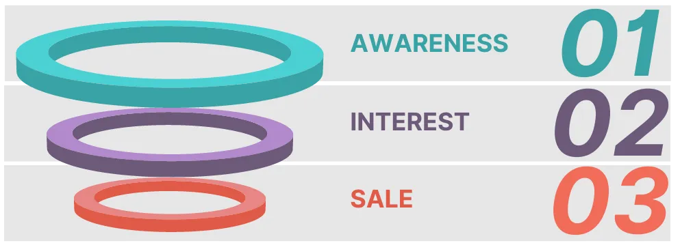
The conversion funnel illustrates the customer’s journey on your website and depends on visitor engagement with your company or product. It includes different lead conversion strategies.
Three main stages of the conversion funnel:
- Top of the funnel (TOFU): Awareness phase
- Middle of the funnel (MOFU): Interest phase
- Bottom of the funnel (BOFU): Sales phase

Successful website conversion rate optimization should be based on the conversion funnel.
Keep in mind that when someone lands on your site, you cannot expect them to become a sales lead and make a purchase instantly. You can set lower conversion rate goals for each stage of the funnel, such as subscribing to a newsletter or downloading an eBook.
Now you have a basic understanding of what conversion rate optimization is and why it’s important.
It’s time to dive into planning your CRO efforts and determining the best tactics to use.
How Can a Website’s Conversion Rate Be Increased?
For the sake of simplicity, increasing the conversion rate means convincing more visitors to take the action that you want them to take.
But first…
Set up goals for your website
For example:
- Click on the video, landing pages, etc.
- Register for an account
- Sign up for a trial
The goal should not be separate from your main business goal. Website goals should be set up for every stage of your funnel.
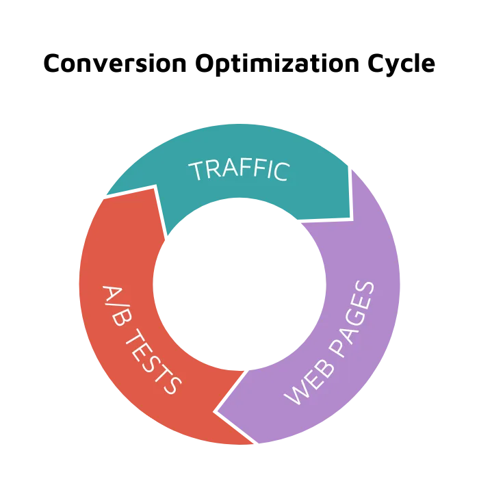
When focusing on improving website conversion rates, it’s important to act on these three areas of optimization:

User traffic
Traffic data play a crucial role in increasing conversion rates. There are several key metrics that deserve your attention when analyzing your traffic data. Some useful free tools for collecting your site’s traffic data are Google Analytics, Hotjar, and Smartlook.
When analyzing traffic to increase website conversions, the following questions will help:
- Where is my traffic coming from (e.g., organic searches, paid advertising, social media, referrals)?
- At what point do website visitors leave my site?
- Are my visitors mostly on desktop or mobile devices?
- Are my visitors mostly new or returning?
- Are there any specific pages or sections that are driving more traffic to my site?
Answering these questions will give you a deeper understanding of how your visitors find your website. Additionally, where you should focus your conversion optimization efforts.
At this stage of applying solutions to increase conversion rates, you should also observe whether traffic changes after implementation.
Web pages
Focus on improving the overall design and user experience of your website. This includes elements such as site navigation, layout, and design as well as the quality of your content and the ease of use of your forms. By improving the overall user experience, you can increase the chances that visitors will stay on your site and convert.
Below are examples of how to improve specific elements on the website to increase conversions.
A/B testing
There is no one-size-fits-all step-by-step conversion rate method that will work on every website. Therefore, it’s essential to test every single element that you plan to alter or introduce as a new solution to ensure that it converts better.
As mentioned above, optimizing your conversion rate is driven by data. It’s a continuous improvement process for which you can use A/B tests.
A/B testing allows you to make alternative changes to your website and compare the results to see which version performs better. In every aspect, you can make A/B tests and show one group of users one type of website (A) and another group the second type of website (B).
This can be done with small changes, such as changing the color of a call-to-action button, or with larger changes, such as redesigning a landing page. Google provides a free tool—Google Optimizer—that you can use to optimize the conversion rate on your website.
How to Increase Conversion Rate: 10 Ways to Improve Your Website's Conversion Rates
1. Make the value of your product and company clear.
It’s important to present your product in a way that resonates with your audience. Providing them with the information they need in an orderly format, as this can greatly impact their engagement with your website. Sometimes, it’s all about “packaging” and how you present your product. If visitors see long, unstructured text instead of brief and useful information. They are much more likely to leave the site.
Remember this when you write about product value:
- Clearly state the benefits of your product or service. Make sure that potential customers understand the specific benefits they will receive from using your product or service.
- Highlight your company’s unique selling points. Clarify what it is that sets your company apart from the competition. This may include things like exceptional customer service, a strong sense of corporate responsibility, or a commitment to using eco-friendly materials.
- Use clear and concise language. Avoid using jargon or industry-specific language that may be confusing to potential customers.
- Present social proof. Showing social proof, like the number of users or customers and awards or certifications you have earned, builds trust and credibility with potential customers.
- Make it easily accessible. Make sure your value proposition is easily accessible on your website. This could be on the homepage or on landing pages of specific products or services.
2. Address possible concerns
It’s crucial to proactively address any objections or concerns that may prevent potential customers from finalizing a purchase. By anticipating questions or doubts, you instill confidence in the website’s integrity.
The following steps will assure potential customers of the value of your product:
- Offer a satisfaction guarantee and a refund option to underscore your confidence in the quality of your product.
- Add information to your sales copy explaining the price of the product.
- Show how your product can solve a specific problem.
3. Use a compelling headline
- Make sure your headline is clear and specific so potential customers know exactly what your page is about and what they can expect to find there.
- Keep your headlines short and to the point, ideally no more than 10–12 words. An effective way to do this is to include keywords relevant to your product or service that potential customers may be searching for. This will not only help your page rank higher in search engine results, but it will also help grab the attention of your target audience.
- To make your headline more dynamic and engaging, use action verbs that create a sense of urgency, for example, “Maximize Your Conversion Rate Potential.”
- Use questions in your headline to make it more engaging and to encourage visitors to click through to your page, for example, “Want to Boost Your Conversion Rates? Try These 9 Proven Tips.”
- Use power words and buzzwords. Buzzwords are words or phrases that have become popular or trendy in a specific industry or field. It’s important to use them strategically and in the right context so they don’t come across as inauthentic or insincere.
4. Add testimonials and customer feedback to your homepage
Create a sense of trust and credibility by showcasing your product and company value from the customer’s perspective.
The majority of consumers (97%) rely on product reviews as a source of information when making buying choices. That’s the power of social proof. Reading customer feedback on a product is like receiving a personal recommendation from a trusted friend.
Options for the use of testimonials on a website:
- Use images of customers or logos of well-known companies that use your products.
- Make a separate section with customer reviews.
- Add customer quotes to your homepage or reviews section.
- Make a carousel with star ratings and quotes from happy customers.
5. Make call-to-action buttons stand out
If you already have a website goal, you can make it happen by highlighting the Call to Action!
The visitor’s gaze should be directed toward the CTA a few seconds after opening your website.
- Use colors that contrast with the background of your website, making the CTA stand out and catch the visitor’s attention.
- Use words that encourage visitors to take action immediately.
- Make it clear what the visitor will gain by clicking on your CTA.
It is generally said that the shorter the CTA, the better. However, the length of the text will depend on your specific goals and your website.
Short CTAs are typically best when the desired action is simple and straightforward.
Examples: “Download Now” or “Sign Up.”
Long CTAs may be more appropriate when the desired action is more complex or the visitor needs more information to make a decision.
Examples: “Sign up for our newsletter and get 10% off your first purchase,” “Download our free guide to improving your website conversion rates.”
The length of the CTA will also depend on its placement on your website.
Keep in mind that the best CTA for your website will depend on your specific goals, and it’s also important to test different versions of your CTA to see which one performs best.
Read also: How to Improve Ecommerce Conversion Rates? 20 Proven Strategies
6. Ensure fast contact with your company
Imagine a potential customer browsing your website intrigued by your products or services.
They want to know more, but as they dig deeper, they can’t find a way to contact you.
Frustrated, they leave your website and turn to a competitor who makes it easy for them to connect with a company representative.
This scenario is all too common and may be the major reason your website’s conversion rates are low.
It’s a must for companies to provide contact information on the website, and even better if you use solutions that will make the distance between the visitor and sales reps shorter so the contact will happen faster.
To learn how to increase conversion rate, follow these three steps. Boost your website's conversion rates by facilitating prompt contact with your company through the website:
- Add a tab with all contact information and place it in a visible location on the homepage.
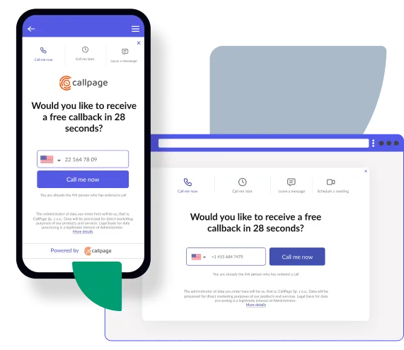
- Add a callback widget that allows visitors to quickly and easily request a callback without having to search for contact information or fill out a lengthy contact form.
- Add a contact form.
By providing clear and accessible contact options, you give visitors the assurance they need to move forward with a purchase and avoid losing them to a competitor. Additionally, a callback widget can be used to capture leads to visitors who are not ready to make a purchase but are interested in the company’s products or services.
It’s important to remember that a visitor who is not yet ready to purchase may want to get in touch.

7. Create user-friendly contact forms
The simpler your contact form is, the likelier people are to fill it out. Only ask for the information you really need, such as name, email, and message. Link to a confirmation message or redirect visitors to a thank-you page after they submit their contact form.
Here are a few options for adding a contact form to the website:
- Use a plugin: Many content management systems such as WordPress have various plugins or modules that can be used to add a contact form to a website.
- Use a form builder: Create and customize your contact form and embed it on your website. You can use online builders like Google Forms or Typeform.
- Code the form manually: If you are familiar with HTML, CSS, and JavaScript, you can create a contact form manually by writing the code for the form, the styling, and the functionality.
Check also the useful WordPress plugin for increasing website conversion rates.
8. Use proper graphics and improve the layout of your crucial website
The selection of appropriate graphics and layout of your website affects how visitors perceive your company. If your company looks professional from the visual side, then visitors to your website will be likelier to reach your product. Here are some tips on how to do it:
Use:
- High-quality images that are relevant to your products or services. Attractive images help establish trust and credibility with visitors.
- Clean and minimal design that is easy to navigate. A clean and uncluttered layout reduces distractions and makes it easier for visitors to focus on your products or services.
- White space effectively creates a sense of balance and make your website more visually appealing. White space also reduces distractions and directs the focus to your products or services.
- Contrasting colors to draw attention to important elements on your website, such as call-to-action buttons.
- Animations to bring your website to life and make it more engaging.
- Visual hierarchy to guide visitors’ attention to the most important elements of your website. For example, use larger text and bold colors for headlines and smaller text and lighter colors for body copy.
By following these tips, you can improve the layout and design of your website, making it more visually appealing and easier for visitors to navigate and, consequently, increase your conversion rates.
9. Improve the mobile UX of your website
Around 60% of all internet traffic worldwide comes from mobile devices. If the data analysis of your website’s traffic also indicates that many visitors access your site via mobile devices, it is crucial to prioritize the optimization of the mobile user experience on your website.
You can use a responsive design to ensure that your website looks clean and easy to use on any device. This will improve the overall user experience and make it likelier that mobile users will convert.
Learn how to increase website conversion rate by implementing these tips to improve mobile user experience (UX):
- Mobile screens are smaller, so it’s important to prioritize the content that’s most important to your users. Use a mobile-first design approach, and make sure the content above the fold is relevant and engaging.
- Make it easy for mobile users to engage with your website by using large, easy-to-tap buttons and by minimizing the number of fields in forms.
- Using gesture-based interactions like swipe and pinch-to-zoom can make navigation more intuitive and improve the overall mobile experience.
By improving your website’s mobile UX, you make it likelier that mobile users will convert by providing them with a seamless and enjoyable experience.
10. Optimize website load times
Slow loading times can lead to high bounce rates as users quickly lose patience and leave the website.
There are several website speed testing tools available, like GTmetrix, Google PageSpeed Insights, or WebPageTest. These tools can help you identify issues that are slowing down your website and suggest ways to fix them. Remember to also check the load times on the mobile version of your website.
Optimize load times and increase website conversion rate with these tips:
- Optimize images. Compress them or use a next-gen format like WebP to reduce page load time and improve website speed for users.
- Enable browser caching. Allow users’ browsers to store certain elements of the website so it loads faster for returning users.
Ensure your website loads quickly, as page load speed is one of the most important factors in determining website conversions.
Conclusions on How to Increase Conversion Rate
Keep in mind the website conversion rate optimization cycle: Check traffic, optimize web pages, and conduct A/B tests. This process should be permanently embedded in your strategy. Before applying any of these suggestions to your website, it’s important to test and verify their effectiveness through data analysis, focusing on how to increase conversion rate. Only then should you proceed with incorporating them into your website design.
Check out other posts
Start generating leads today!
Get a 14-day free trial now,
set up the widget on your site, and see how many more leads you can capture with CallPage
- No credit card required
- 10 minutes set up
- 14 days fully-featured free trial